Thursday, 28 January 2010

Mock up idea for double spread

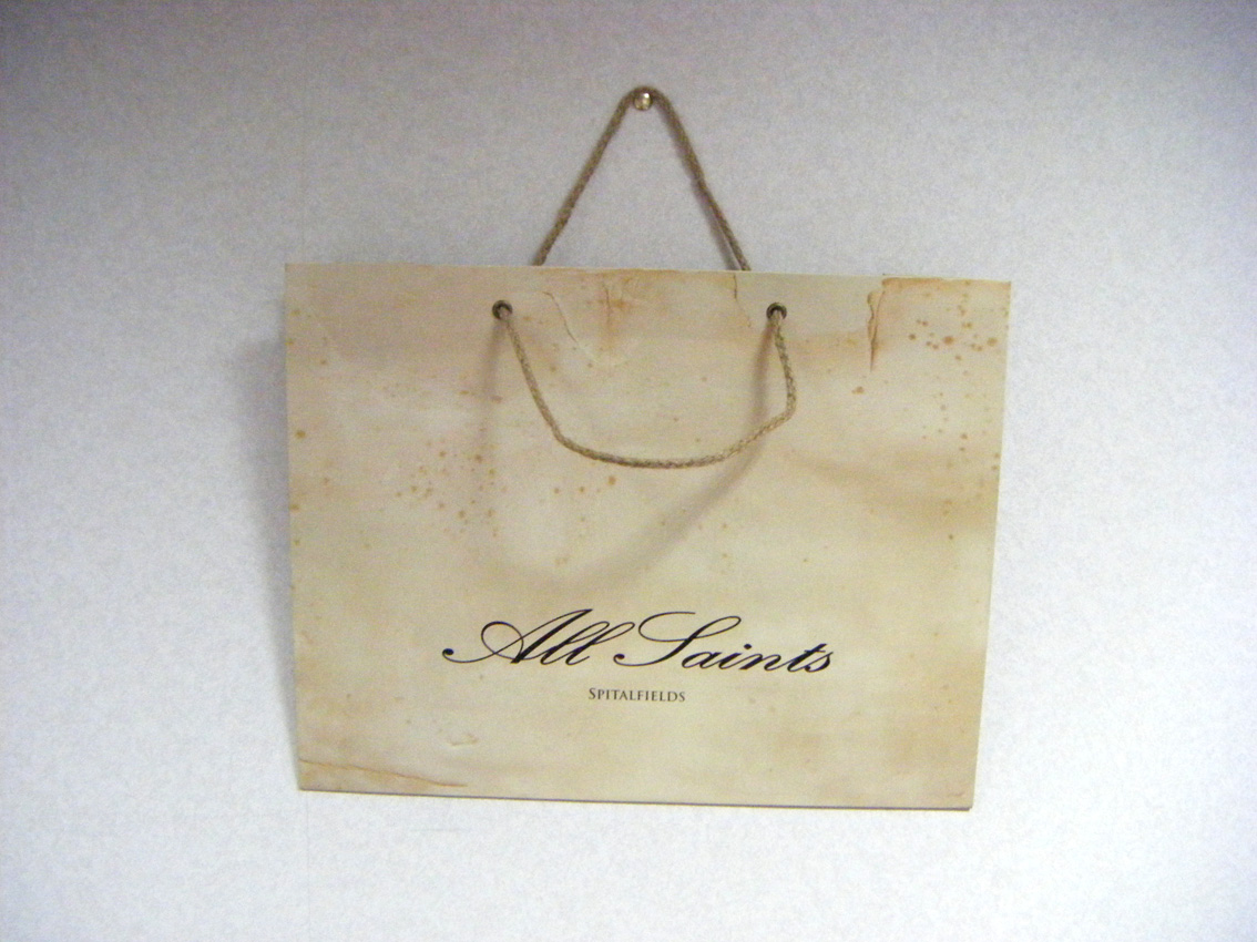
This is an idea I got from my previous post, about all saints bags. I looked at the style of the bags, and recreated it on photoshop, so that it gave the photo an urban/indie feel. I like the pose used in this photo, because it relates to the name of the magazine (chord). I liked how the photo is on one side, and the writing is on the other, i think that this makes it look simple, and stylish. This double spread page is an idea of what I want my real double spread to look like.

Tuesday, 26 January 2010

Burn Background, All Saints inspired


When I was looking for insperation for backgrounds, I couldn't find any magazine with a background I was looking for, I did however like the all bag design, with the rough looking style, and urban layout, which I think looks good. So I used Photoshop to "burn" the background to make it look slightly rough, and burnt. This is the style I am going for.

(Click to enlarge)


Friday, 22 January 2010

Different poses to take into consideration


Poses for the front cover, contents and double spread.
With my last experiment, I learnt that I needed to focus on how to have the person standing, and posing, because the way they are posing, portrays the image of the magazine.
I decided to test different props, including a vintage radio, and some chords. I chose these props because, the radio related to music, and I liked the look of a vintage radio, and I chose the chords because it related to the title of the magazine, and I thought that this could become iconic with futures issues.
With these pictures, I didn't edit the colour of them, because I wanted to focus more on the picture, naturally, rather than an edited version. I will however edit the photos, if I decide to use them for the cover.
I took these photos using my DSLR, and I used a desk lamp with the lamp shade taken off to make the shadow really vivid, which I think looks good.

Thursday, 21 January 2010

Double page spread article

Jez

live gig pictures

These are just some of the photos I have taken of live gigs which I could use in my magazine.
I think that my magazine will need some photos of a live event, to make the genre more clear.

Black background and Colour model


Background Colour


I have decided that, for my final designs, I may use a colourless background, and colour model, I will however use the light painting effect, which I have been experimenting with throughout my coursework. I think that the background contrasting with the model will make the cover 'pop', because colour attracts the eye, therefore more readers may be influenced to buy the magazine.

When I set out to take photos for my magazine, I will put a lot of thought into the poses I will tell them to do, Because, in my opinion a pose is everything. An original pose says "original magazine", and I think Indie is all about being original. I'm not sure I like the pose I experimented with, because I don't think they are as original as they could be, also they don't contain the light painting, as I can't light paint around myself.
To take these photos, I simply set the camera down on a tripod, and hit self timer. I then used photoshop to adjust the colours.


Tuesday, 19 January 2010

Audience Profile

AUDIENCE PROFILE

Gradients


I decided to test the effect of the use of gradient, because I thought that this could be used as a background for a magazine cover, or even perhaps the contents and double spread.
I like the use of the light contrasting with the dark shades, because it gives sense of professionalism (if done right) because it resembles a studio.
Experimenting with gradient gave me ideas of how I could position a spot light from a corner, or centre so that it makes the levels of light uneven, giving a gradient effect. I like the use of monochrome colours also, because this makes the image which will be in front, stand out, and contrast with the greys and whites.

Testing fonts


After picking a variety of fonts, I decided to narrow it down even more, and tested them behing a background image.
The fonts I chose were black, which didn't go very well with the background, because it didnt stand out. Therefore I have decided to use a lighter background, such as a white, grey or cream. This way the title will stand out a lot more.

I didn't like the use of black and white either, because I thought it look bland.


I chose to have a green background, so that the fonts contrasted, and stand out more, and I think that this was successful, because it looks original, and simple, which is what my cover aims to be like.


My Pitch

Pitch


After I presented my pitch, I recvieved feedback sheets from the rest of the class, and these are what I found most helpful;


The feedback I recieved was helpful, because before the pitch, I was uncertain to what I wanted my front cover to look like, however after gaining feedback to what would look good, and what wouldn't look good, I have been able to develop my idea's further.


I think that I could of presented my work on font schemes to the class, to show them more ideas of the style I want my magazine to have.


If I was to redo my pitch, I would definatly present a clearer idea of what I want my magazine to look like, perhaps create some kind of mock up, and get opinions off the rest of the group, and perhaps even more ideas to develop off.


Monday, 18 January 2010

Test Shot

During my free period, I decided to go out with Lily and do some test shots. I liked to industrial look, however I prefer the light painting effect, because I think this is more original.

Thursday, 14 January 2010

Light testing

Light Painting

For my magazine, I am interested in using 'light painting' as a main feature.
I haven't ever seen this before on a magazine, so I think it would be a good idea to introduce it, as it would be original.
I tested a few photos of how I could use this form of technology, and these are some I produced:

Since my magazine will be called Chord, I thought it would be a good Idea to do a light painting effect with the title written in lights. I thought this looked good, but I think I prefer a regular bold title.


For the main picture, I was thinking something like this. I like the look of light surrounding the person, because I think it makes the person look important, and brings attention to this person, which is the main point of the main image of a front cover. However I would choose to do this on a plain background, so that the photo is not too busy. Like this....


Tuesday, 12 January 2010

The boat that rocked and Hot Fuzz

Friday, 8 January 2010

Fonts

Fonts

Looking at fonts was an interesting, and useful task. I learnt which direction I wanted to take my magazine in. Fonts are an important feature in every magazine, because for some covers, they can become iconic, for example the 'RollingStones' font is known world wide. Therefore fonts can contribute to a reputation.

I decided that I wanted to go for a "stencil like" font, because I thought this matched my idea of what I want the magazine to look like. However, when browsing the Internet for fonts, I came across handwritten fonts, which I thought looked effective. Although I liked the handwritten fonts, I think they can sometimes take away from the magazine's classiness, because (depending on the handwriting), it can make the magazine look perhaps scruffy. For the image I have in my mind of my magazine, i think it's best that I stick to the more... bold/stencil look, because I think this says music, more than handwritten fonts.

Wednesday, 6 January 2010

These are just a few of the magazines I decided to look at, with anaylis

Tuesday, 5 January 2010

Contents page analysis

The NME contents page is mostly textual, rather than pictorial. The main section of this contents page, is of course the ' Albums of 2009' section, we can see this because it is the largest thing on the page, making the reader look straight at it.
The page numbers are situated to the right of the subject matter, but not the clearest thing to read. On this contents page, there is quite a lot of information packed into just one page, making it look untidy, and disorganised. The contents page normally has some kind of link, which links to the front cover, in this case it could be perhaps the NME logo, which would be the same for all issues, and covers. By looking at the contents page, it is easy to see that it is an NME contents page, because of their consistent style, which is applied to most issues. I however prefer the less cramped style contents page, which would normally be easier to read, and understand.

The Kerrang contents pages are a lot more simple than NME, mainly because they are mostly pictorial, rather then textual. Therefore making them faster, and easier to read. The main feature of this contents page is the band 'Chiodos', We can see this, because the image of the their section of the contents page is bigger, therefore making the audience look at it first. The page numbers are situated in the pictures with relate to the pages, which barely requires any reading. The colour scheme of this contents page is consistent with most kerrang covers (yellow and black), which makes these colours iconic to the magazine. I like this cover, because it is simple, and quick to understand, as there is not much text to read through.

The Q contents page is simple and effective. It contains only two pictures, which are related to the main articles in the magazine. The pictures have their own page number on, so the reader can look at the image of the main subject, and jump straight to the page.
Although this contents page is more textual, than pictorial, it is still simple, and easy to understand, because the main points are highlighted in bold, so when the reader is scanning through the page numbers, they can just see the title of what they are looking for, and jump straight to that page. All of the page numbers are situated to the left. I like this contents page the best, because the page numbers are split into different bold headings, making it clearer to read, without the use of too many pictures.

This is the contents page of SPIN. This is my favourite out of all the contents pages I have studied, because the background image takes over the whole page, without contrasting, and clashing with any other image on the page, keeping up with the classy image, which spin holds. Although it is most textual, the text is very few, making it easy for the reader to navigate around. The spin logo is situated in the top right, contrasting with everything else on the page, which looks good because it is a spin magazine after all. The page numbers are situated with headings in bold to the left of the page, making it simple to read, because the English language is read from left to right.

For my contents page, I hope to produce something like the spin contents page, because I love their use of simplicity, and the one one picture. I like the kerrang contents page because it is mostly pictorial, therefore faster to read, But it is a magazine after all, therefore reading is a key factor, not a problem. I dislike the NME contents page purly because it looks disorganised and is difficult to know where it starts and ends.