


Saturday 17 April 2010


Friday 16 April 2010
Final post! -Evaluation
Evaluating media from Jack Fox on Vimeo.
I have organised my blog into labels and blog archives, which should make it easier to find your way around. The music I have incorporated on my blog is related to my magazine, and the kind of bands you will find inside Chord.
I feel that I have learnt a lot during the time of production of my magazine, and I hope all my hard work has paid off.
Gooooood bye!
Thursday 25 March 2010
Equipment used to produce my coursework


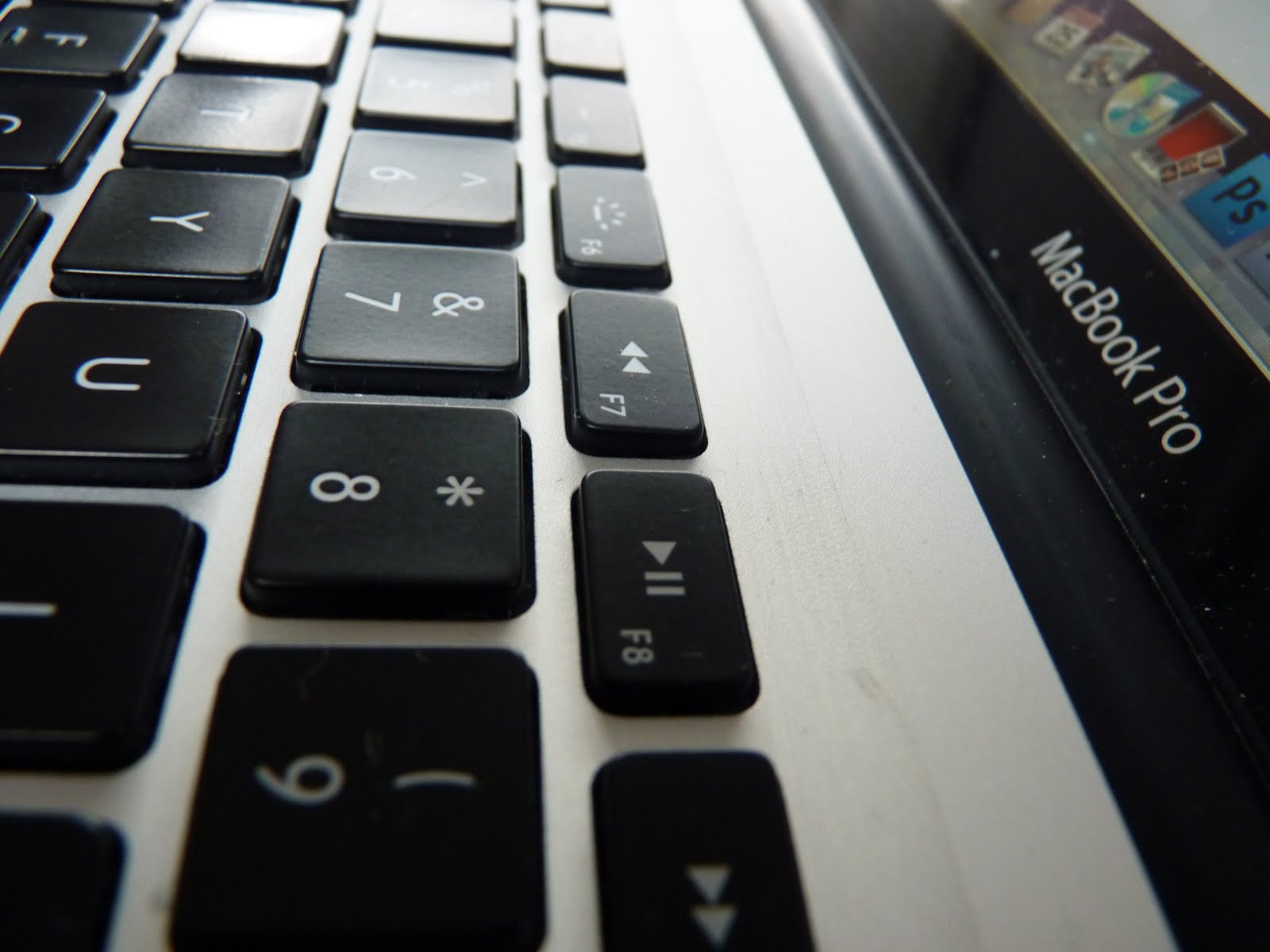


These are the equipment I used to produce media coursework. They involve a MacBook Pro and Lumix DSLR. The use of my own equipment has been a huge advantage for me, because it meant that I could do the research and planning at college in my lessons, and then actually do the practical work in my own time.
Choice of three content pages

Personally, I preferred the middle one, but I was torn between the first and second, so I mixed them together, which I think makes it look better, this is what I developed...

i'm going to ask people which one they prefer, and they can leave their comments below.
So, which one do you prefer?
Monday 22 March 2010
More contents page changes
I was experimenting with layout of pictures and text, and I simply moved some pictures all together, and made the background darker. I think this looks better than the other one, because it's more organised.


Sunday 21 March 2010
Mock up sunday
Today I spent part of the day looking at my ideas for my contents page, and trying to work out what I didn't like about it. I found out that I didn't like that there wasn't much text on the page, which made it look less professional, because the pictures were on there own, which made them irrelevant. So I went back to the drawing board, to decide where I could include more text, which linked with the pictures. This is what I developed....

This is only a mock, but basically what I think my contents page should look like. I added a 'Feature' section, because I think that this is a fundamental part of any contents page, because this is what tells the reader what to expect to see inside. I like the use of text and images in this version of my contents page, because they are well balanced and easy to read, and they cover the main points in my magazine. The red square in the photo above is simply to show where a picture will go, as soon as I have taken it. The picture will consist of a small group of people, which will be a band featured in the magazine, because I think that I need to include some kind of band to make the magazine theme more believable.
I also decided to shrink the "contents" title and move it in the corner of the page, because I don't think people really need to see that it is a contents page, because they most likely will already know.
To Do List:

Thursday 18 March 2010
More changes
I reworked some pages once again, and I am happy with the double page spread now, although I will need to add more pages to the contents, and perhaps add more text to relate to the images, which is next on my todo list.

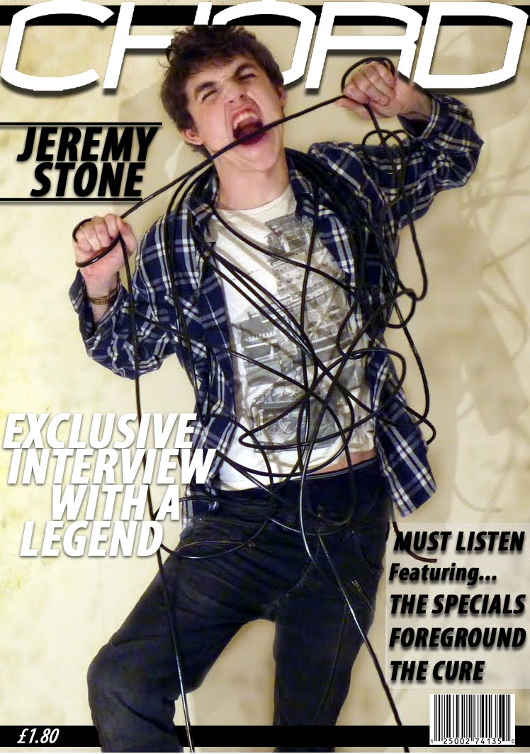
This double page spread consists of more text, and a darker background around Jeremy Stone, which stops before it reachers the smaller pictures, which helps break up the page. I used the lasso tool combined with the eraser in photo to cut Jeremy Stone out of the dark background. I changed the colour of the introduction to my article, so this breaks up the article. I also added a quote from my article, and placed it above Jeremy Stone's head, which helps fill out the gaps on the page, and makes the page look a lot better arranged.

Monday 15 March 2010
Friday 12 March 2010
Rework of magazine:
1) 2)
2) 
 2)
2) 
After listening to some feedback, I decided to try to use a different picture for my magazine cover. I also used a different font title, just to test out some of the fonts included in photoshop, rather than a font I previously downloaded. In my opinion I like the second one better, because it's more original, and spicy, however I wasn't exactly sure. So I went and got some feedback from others in my media class, and other people who don't take media. The minority agreed with me, which made me feel more confident that this was the correct image to use for a front cover.
Friday 5 March 2010
Adding pictures to double page spread
I decided that I didn't like my double page spread, because it didn't seem to have a specific edge I was looking for, So I decided to go back to and rework some objects, and add more pictures. This is what I came up with:

I added 2 more pictures over some fake wire, which I drew on photoshop, and used the emboss tool to make it look authentic.
I like the look of this, better to my previous double page spread, however I plan on adding more text, and perhaps some kind of background to the main image, to show some cutting out skills, and to make the page look more effective.
Developing ideas for new contents page
(Just a mock up)

I think that this layout is better than my previous one, because it includes more pictures, however I don't like the colour scheme, because it makes the text less vibrant and less obvious, because the background contains too much white.
I think what my contents page needs is a picture of a band, because currently, its all solo artists. I need to show more skills with photoshop also, I will do this by perhaps cutting around a complicated image, and changing the background, which will demonstrate 1 or 2 more skills. I will also add more pages to my magazine, because 21 pages just isn't enough.

Friday 26 February 2010
Feedback
Feedback For Drafts.
My peers evaluated my drafts for my magazine, and this is a summery of their comments:
Genre: Indie
Audience: The audience that my peers guessed were ranged from teenagers to mid twenties, which is what I was aiming for .
Success: Matched the mark scheme very well, the use of wire as prop, fonts and shaddows, large background dps, good colour scheme.
Improvements: Experiment with different angle pics.
Average Level: Mid 4
Thursday 25 February 2010
Wednesday 24 February 2010
Contents page with the use of pictures

A suggestion was made that perhaps my contents page should include more pictures, so I decided to test this out this idea, and add some pictures to the page.
I'm not sure If like the use of pictures, because from the star I said I wanted my magazine to look as simple, and the use of colourful clashing pictures, in my opinion, makes the contents page look a bit too full, even though I only used three pictures. I like how the pictures are angled though, because this makes them look qwerky, and fun.
I also made the background slightly lighter, because I thought that this matched the double page spread a lot more. This is one idea I will defiantly use, however the pictures are perhaps a no go.
Double Spread draft - Modification

I decided to change the size of some of the words in the article. I picked out words I think the audience are most likely want to hear about, So love, romance, music, secret ect. I like this idea, because they act as keywords, so that the reader can look at these words, before reading the article, and know what install for them. I also think it helps break up the text, and layout, making it look a lot more pleasing to the eye.
Thursday 18 February 2010
Case Study Notes
Bridget jones
Target audience – Woman 18 to 35. Romantic comedy fans. Single woman looking for “mr right”
Vertical intergration
Specific examples
Green Zone
Effective tagline
Budget: $100,000,000, Been refered to as a flop
target audience: 15+, action fans, war fans
Dailymail says= ‘preachy political trailer disguised as a warm film’
Production practices: intent to adapt a book to film
Technologies: twitter facebook, 3D + digital screenings – Cuts down piracy = encrypted codes
Greenzone make use of technology, where as Avatar(James Cameron) had to wait 13 years until technology bettered.
Comparison: greenzone = bus billboard & avatar = big 60inch billboards in NY, and London ect.
Dead mans shoes – working class man
Green zome – 4 quadron and matt damon attract women
Big budget = more prints.
The soloist
Based on true story
Budget for this movie was $60 million
117 mins long 12A/ cat E (british company with American culture)
Main cast: Jamie Foxx, Robert Downey JR, and catherin keener
Writeen by Susannah grant and steve lopez
Directed by Joe Write - pride and prejudice and atonement)
Places the movie was filmed in LA and Ohio.
Marketing: Marketed internet, billboards, and commercials
Used homeless people as extras
Many people believed the advertising was misleading.
Filmed in 5 mm print, Distributed through DSN sites
Release date held back due to another movie being more popular.
Film festivals, the soloist was going to open 2009, but it was classed as a flop before it had even hit the cinemas.
Working Title with Universal – conglomerate
This is England
Used DSN which tripled its size
Used prefabricated sets – cheaper, and more realistic
£90,000 grant from the national lottery
Green zone
Drama
115 mins long
UK release date: 12/3/2010
Directed by Paul Greengrass – borne of premacy
Country US/UK
Universal Pictures
Earnt $14,309,295 in 3,003 theatres
Compared to shutter island, green zone did twice as well in the UK.
As march 2010, green zone grossed $31,218,390 in the US and $60,019,390 world wide
Similar to casino royal, which both use ATL advertising
Uses internet a lot to target internet peeps.
In exam use terminology
Video games for xbox, PS3, Wii ect, before a film comes out
Synergy – advertising with in games
Sky pop ups
4OD – online streaming – Pop up adverts
Bluetooth in cinemas
Myspace – keywords on profile
Facebook – fanpages/groups
Love film – free DVDs ,blanket emails
iPhones – downloadable apps – adverts have to click on the get rid of
apple mac – front row trailers
Tuesday 9 February 2010
Looking at Fonts
These are my three fonts I decided to use throughout my magazine, I decided to only use three because that way, it wouldn't look tacky and would look a lot more professional. I downloaded these fonts to my photoshop on my mac from http://www.dafont.com.


Double page spread draft

DOUBLE PAGE SPEAD
I like the look of my double page spread, because I like how the image is sperate from the article. I had some trouble positioning my writing in box layers, because I couldn't find where to put them, without it looking too crouded, but I think that I managed to find an alternative without blocking the photo, or making it look too busy. I think the column idea is a great success, because it makes the page look organised and tidy, and the writing is still readable. From my original mock up idea, I changed the position of Jeremy Stone, and made the background longer on photoshop, with the use of spot healing tool, and then the burn tool. I'm not sure if I like the title of the page though, because I dont think that it stands out as much as it could, so I'm considering revising my desicion, and making the font more visable. Overall though I like this design, and I think that the final design will look something very much like this.
Monday 8 February 2010
Contents Draft


When coming up with design ideas for my contents page, I wanted it to look similar to my front cover, but I couldn't make up my mind to which font style to use for my contents, so I uploaded both so that I could get some peer feedback, to help me decide. I plan on changing a few things on this, because I think that this can look a bit simple, so I decided to have the banner at the bottom run between the persons (Jeremy Stone) legs, so that this showed some use of layers. I love this photo because this really portrays the whole 'vintage' look that I am going for, with the 60's radio, and the hat. I decided to make the background look rough too, for this I used the burn tool on photoshop, just like my front cover, so that the layouts are consistent, which makes the magazine look professional.
Other masthead ideas


After asking others what they thought of my font cover, I got some good feedback, and constructive criticism about the fonts of the masthead, so decided to do some further experiments with the colour, and also the font styles. I first tested out the use of gradient inside the font, which I thought looked pretty good, and also shows good use of photoshop. I also added lines over the "Jeremy Stone" text so that it separated it from the rest of the cover, because I think that this is important, so that the reader knows the main subject of the cover, which is Jeremy Stone. After testing the gradients, I went on changing the font style to "braggadocio, which I thought was original, but didn't really look vintage, which is what I was aiming for.

The people who I received feedback from also said that I should photoshop out the brand of boxers, because this could look silly in the final design, so I took their feedback into consideration and photoshopped it out.
Overall I am happy with my draft, because I think that it looks vintage, and original. I am happy with the colour scheme used as well, although I could maybe be more creative with the colour scheme, so that it looks even more original, however I don't want to go too far, and make the magazine look a bit "over the top".


Sunday 7 February 2010
Cover Design Draft

I like this cover, I like how the use of italic fonts, used with the bold format, I think this gives a vintage look, which is the look i was going for.

The background image was taken on my SLR camera, and I used a desk lamp, with the lamp shade taken off to get the shadow effect. I like how the photo involves chord, which relates to the name of the magazine. As this is only a draft, I do plan on changing a few things, such as the size of the background, so that I can perhaps fit more text inside the cover, because this is one of the main things I struggled with. However, I like how some of the text goes over the picture, and some goes under it, I think that this shows good use of layers in photoshop.
Wednesday 3 February 2010
Monday 1 February 2010

Thursday 28 January 2010
Mock up idea for double spread

This is an idea I got from my previous post, about all saints bags. I looked at the style of the bags, and recreated it on photoshop, so that it gave the photo an urban/indie feel. I like the pose used in this photo, because it relates to the name of the magazine (chord). I liked how the photo is on one side, and the writing is on the other, i think that this makes it look simple, and stylish. This double spread page is an idea of what I want my real double spread to look like.
Tuesday 26 January 2010
Burn Background, All Saints inspired
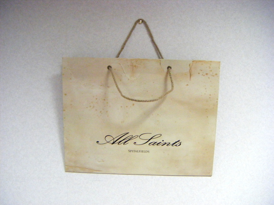
When I was looking for insperation for backgrounds, I couldn't find any magazine with a background I was looking for, I did however like the all bag design, with the rough looking style, and urban layout, which I think looks good. So I used Photoshop to "burn" the background to make it look slightly rough, and burnt. This is the style I am going for.


(Click to enlarge)
Friday 22 January 2010
Different poses to take into consideration

Poses for the front cover, contents and double spread.
With my last experiment, I learnt that I needed to focus on how to have the person standing, and posing, because the way they are posing, portrays the image of the magazine.
I decided to test different props, including a vintage radio, and some chords. I chose these props because, the radio related to music, and I liked the look of a vintage radio, and I chose the chords because it related to the title of the magazine, and I thought that this could become iconic with futures issues.
With these pictures, I didn't edit the colour of them, because I wanted to focus more on the picture, naturally, rather than an edited version. I will however edit the photos, if I decide to use them for the cover.
I took these photos using my DSLR, and I used a desk lamp with the lamp shade taken off to make the shadow really vivid, which I think looks good.


