He has learnt alot from producing low budget films and realised you can produce a good film with out state of the art technology and superstar actors.
He has also learnt that having famous actors in it doesnt necessarily mean it is a good film as if the actor does not fit the story then it's better to have an established actor who does.
Shane thought it was a challenge to produce as he had to stick to his budget and had to try to recreate the 1980's. Fortunately he found an 80's looking estate in nottingham, which had not yet been modernised, this did not affect the budget. He then had to recreate the look with props, renting cars from the 1980's era would have cost a huge £150,000, so they brought them off of ebay for a mere £100 a car.
To create social realism they used nartural and domestic light, which also did not affect the budget.
Working Title and Warp Films Institution and Audiences
AOs Production Practices to appeal to audiences Distribution and Marketing strategies to raise audience awareness New technologies to help target specific audiences Audience and how they challenge institutions
1.Working title are a British film production company who are based in London. It was founded by Tim Bevan and Sarah Radclyffe in 1982. They produce feature films and some television productions. It is not a conglomerate. Warp Films is a sister company of warp records, was set up in 1999 with funding from NESTA. It is based in Sheffield, England, with a further office in London and has 14 full-time staff. It is a conglomerate. 2. The ownership of the company affects the budget of the film because if it is a wealthy company the film can be high budget and if it has not got a lot of money to invest the film is low budget. If the company has been invested in by other owners and lots of money has been invested there is more money for multimillion dollar films. 3. Warp films have produced films such as: • My Wrongs • Dead man’s Shoes • Rubber Johnny • Scummy Man (arctic monkeys video) • This is England • “grow your own” • Dog Altogther • All Tomorrow’s Parties Working title have produced films such as: • Pride and prejudice • Notting hill • Nanny McPhee • Shaun of the dead • Bridget Jones’ Diary • The Calcium Kid and many more... 4. Working titles film bridget jones’ diary had a budget of $26 million, and made $ 282 million. It was very successful and a sequal was made. Working title who produced This is England had a budget of $1.2 million, they made $315,000 profit. 5. The matrix had a budget of $ 742128461 and made a profit of an estimated $363000000. 6. NESTA provide funding for warp films and Universal invested into working title. 7. Warp Films budget affects the genre as they have more money so can use special affects and stunts, for things such as action films. 8. It is appealing because it looks realistic and can relate to problems in the world such as war. It is also exciting and builds suspense so the audience may find it appealing. 9. Warp and working title aim at a general audience. 10. Working titles main genre is romantic comedy.
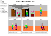
Upon starting our film preliminary, we had to first produce a story board, which we could then use to develop our film from. Our story board had to consist of someone opening a door, walking across a room, then include a small amount of dialogue. Our group developed the idea of a teacher coming into a staff room and having a conversation with another teacher about a student who misbehaves. The talk about getting him expelled. We used close ups, pans, and over the shoulder shots, and we also stuck to the 180 degree rule.
During the filming process, we decided that we would change a few things on our story board, and improvise a few shots, because we thought we could improve on our original story board. The shot we started with, was an establishing shot of the door, which then zoomed into an extreme close up of the door handle, and the character’s hand opening the door. We added a school bell sound effect, so the audience could get the idea that we were filming in a school, and get the general idea of the plot, this added to the mise en scene of our video. We also added a creaky door effect, which gave an old effect, which matched the old door. We later included another establishing shot of the door, but from the other side, so that the audience could see the character and where she was going. This establishing shot also included another character, so the audience could see who was in the room, and give a brief introduction of the 2nd character. Although this establishing shot got the job done, I think that the continuity would of flowed better if we had used a pan shot, and showed the camera panning from the 1st character, to the second, this gives a bit of life to the video, rather than just having a simple stationary shot. We did however use a pan shot throughout the dialogue of the characters, when they were discussing the students report, and passing it to eachother. We used an over the shoulder shot, which turned into a close up, to reveal the school report to the audience, which I thought worked well because it allowed the viewers to get involved with the context of the video.
During the over the shoulder shot, we made sure that we stuck to the 180 degree rule, because we thought that this made the film a lot more professional, because this is what is key in the movie industry. Although it worked, I think the flow of the different shots could have been improved, perhaps by the smoothness of the shots. I think a problem we had was between each shot, the characters continuity was incorrect, because their positions changed after each shot, which reduced realism.
After the dialogue scenes, we used a pan shot, which panned outside the window, and later zoomed in. In the post production process, we sped this shot up, and later slowed it right down, and we also added a mysterious soundtrack, which was tension building, we wanted to experiment with music, and camera shots to build tension, we also though it added a twist.
During pre production, we shot a number of scenes, a number of times. Later, in post production we cut parts out, and slotted them in between other shots, to make the continuity more accurate, After adjusting the shots, and deciding where we want everything, we added a brighter colour filter, which gave the film a greater contrast.
The lighting in this room was bright, and natural, because we chose a room with big windows, and a well lit scene, this would make the colour filters stand out more in post production. The key thing I learnt throughout this, was that adding sound to a shot, which is meant to mysterious, and tension building is effective, and works well. I also learnt that continuity is a key factor, I know our video could improve on continuity, and I think this is what lets our film down. I also learnt that continuity errors is almost comical, because you can’t take the film seriously if it contains all these obvious errors.
For our print preliminary, We decided to do a school fashion magazine, because we thought that this would be different from the ordinary school magazine. We can also take ideas from other fashion magazines.
When we planned our magazine, We decided we would use the three colour scheme convention, which made the magazine look a lot more professional, and authentic. The colours we decided to use were grey, red, and white, We chose these colours because they contrast with each other very well, for example the Red, with the gray. As well as contrasting, we thought they go together well, without looking tacky.
When we took the photo, we decided to make our model based to the left, then we could focus the right side to cover lines, we thought this looked effective because the writing then didn’t need to cover the model, but could still be read.
We decided to break this rule for the masthead though, because the masthead is perhaps the main source of text, because it is the name of the magazine, therefore, we decided to stretch this across the whole top of the page, so it stands out from the rest of the text. We decided to have the model’s head come over a little bit of the text, so that the masthead doesn’t cut into the picture.
Underneath our masthead, we decided to put the slogan in a smaller font, in grey and red, to match the colour scheme, but not be too extravagant. We added a shadow to the text to make it pop out of the page, and it added sophistication to the cover.
We decided to add shapes and symbols >> to our cover, because they break up the page, and make it more interesting, and appealing, it also adds professionalism to the cover too, as this is what magazines, such as GQ, and NYLON do.
For our contents page, we decided to keep the colour scheme and fonts consistent, as this furthered the look of professionalism, and made the magazine colour scheme iconic, if used over again.
We decided to keep the convention of allocation of pictures of text, by this I mean, the way having things allocated to the left, as like the cover.
The text font, and colours we decided to keep the same, although we had to make it smaller, so that we could fit it all in. We did however add more shadow to the text, to justify the decrease in size of the font, to make the writing stand out more, and still be eligible. We also added a shadow to the pictures, so that it made the pictures pop of from the page, and look a lot more interesting, and appealing, This also matched the convention used in the text.
For all our photo’s used in this magazine, we faded the colour of the photos, this gave the photos a cool, bluey effect, which made the magazine look, smooth and cool, and more high quality.
Throughout this print preliminary, I have learnt how effective colour schemes are, and consistency. I also learnt how simple changes, such as the colour of the photo, can make a huge impact in the impression given off by the magazine.
We were given a task to create a front cover a magazine that resembles a current magazine.
We had to take our own photos, and use photoshop to create the text/objects/ect for the cover.
The cover which I decided to Replicate, was the GQ magazine, with Robert Pattinson.
The colours used in the cover were, red, grey, and white. This stuck to the regular standards of a magazine, and looks professional. I did however use a black colour font, which matches the tie, in the picture.
All of the colours in the front cover match the clothes from within the picture, this makes the magazine, look stylish, and sleek.
I think because the colours are so matchy, it relates to the fashion side of the magazine, and because the colours are mainly greys, blacks and white, its sophisticated and mature, which relates to the older teen, to the middle aged, male audience (18-30).
The cover lines in this cover are mainly tech, and clothes related, which relates to men, as it is a mens magazine. The main points the publisher wants to highlight, are coloured with red, which matches the magazine title.
Because the magazine title is over everything, I think it relates to the new readers, as well as the older readers, for example, take a typical Rolling Stones cover ;
The Rolling Stones title is behind everything else. This is because the magazine is relating more to its current readers, because they already know that the title says rollingstones.
I think the best title layout, is the way GQ present their title, because it's striking, and new readers can relate to it.


 The Rolling Stones title is behind everything else. This is because the magazine is relating more to its current readers, because they already know that the title says rollingstones.